Rainbow Colormaps
A poorly chosen colormap between values and colors can fool the human eyes to, e.g., pick out non-existing features, or to hide important features.
Common Implementations
Jet
Classic rainbow colormap gradient.
Turbo (Google)
Google’s take on providing an alternative to Jet to improve detail and assessment at the expense of accuracy. Provides an interesting evaluation of tradeoffs and why sometimes a rainbow map is the right choice.
You probably don’t want to use a rainbow
- The use of every color can make it unclear what the important information is.
- Each color has a different luminance, so a color in the middle of a rainbow map, may be perceived as brighter than a color on the ends. This also has a negative effect when printing in black and white.
- Rainbow maps don’t work well in terms of accessibility, CVD.
Once you see a rainbow maps, you’ll start seeing them everywhere. I started noticing I was stumbled across rainbow colormaps while researching Network Visualizations at work while reading: https://arxiv.org/pdf/2303.02514.pdf.
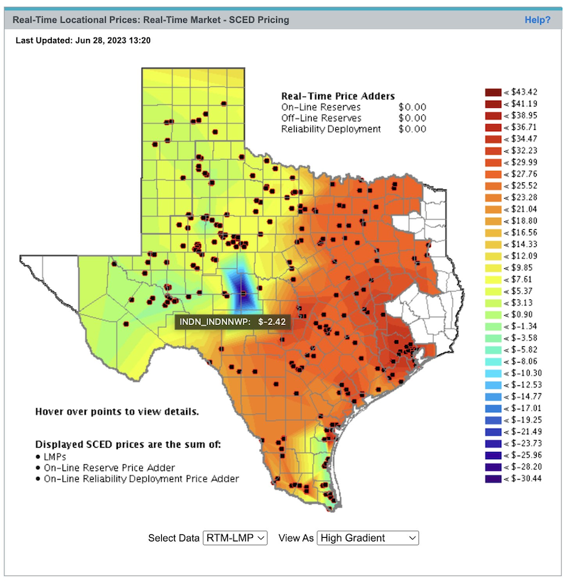
They’re not that bad, maybe?
Here’s another one showing current prices from ERCOT (ERCOT controls the electrical grid in Texas, USA) source: https://www.ercot.com/content/cdr/contours/rtmLmp.html.
Here’s what it looks like in black and white, as well as with dichromal red blind CVD.
Resources
- https://eagereyes.org/blog/2023/rainbow-colormaps-are-not-all-bad-paper - Maybe rainbows aren’t all that bad.
- https://agilescientific.com/blog/2017/12/14/no-more-rainbows - Highly visual comparison and explains why rainbow colormaps are bad compared to other options.
- https://www.kennethmoreland.com/color-advice/BadColorMaps.pdf
- https://www.kennethmoreland.com/color-maps/ColorMapsExpanded.pdf - Great whitepaper discussing why rainbow maps sucks, and different color schemes: qualitative, sqequential, diverging. The other thought he adds is to use a color scheme that let’s you overlay annotations with maximum color optoins. With a rainbow chart, every color is userd, so adding annotations/labels overlaid on the image could get washed out.
- Karim RM, Kwon O-H, Park C, Lee K. “A Study of Colormaps in Network Visualization.” Applied Sciences. 2019; 9(20):4228. https://doi.org/10.3390/app9204228 An example paper with rainbow colormaps applied to data tables as “heatmaps”.
Related Notes
- Gestalt Visual Principles
- Hacking in Color
- Information Dashboard Design
- Colormaps
- Procedural Terrain Generation
- Stock Market Dashboard with Vue.js
- Rainbow Colormaps
- Shape Coding


