Information Dashboard Design

A dashboard is a visual display of the most important information needed to achieve one or more objectives, consolidated and arranged on a single screen so the information can be monitored at a glance.
– Few, Stephen (2013) Information Dashboard Design (pp 26) Analytics Press
Purpose
- Visual display
- Important information
- To achieve objective(s)
- On a single screen
- At a glance
What they are not
- for data exploration/analysis
- portals or scorecards
- reports to look up specific facts
Dashboards are not for keeping up with information. They’re for maintaining the awareness that’s needed to prevent problems, take advantage of opportunities, and take steps that will maintain or improve performance.
– Few, Stephen (2013) Information Dashboard Design (pp 62) Analytics Press
Situational Awareness
Basically, SA is being aware of what is happening around you and understanding what that information means to you now and in the future. This awareness is usually defined in terms of what information is important for a particular job or goal. The concept of SA is usually applied to operational situations, where people must have SA for a specified reason, for example in order to drive a car, treat a patient, or separate traffic as an air traffic controller. Therefore, SA is normally defined as it relates to the goals and objectives of a specific job or function.
SA in 3 levels:
- Level 1: perception of the elements in the environment,
- Level 2: comprehension of the current situation, and
- Level 3: projection of future status.
Considerations
- Define the dashboard’s purpose. Remember dashboards are for monitoring performance at a glance. Not for data analysis/exploration.
- understand the mental models of the domain. Are they complex of simple? The information density of the model will drive the information density and requirements of the dashboard. Match the dashboard to the user’s abilities.
- Define what information is important for SA.
Questions
- update frequency: streaming/daily/weekly?
- how many users, what roles?
- what does it need to monitor?
- what questions should the dashboard answer?
Monitor with context
- what actions will be taken based on those answers?
- what’s the right content to provide for each piece of important information? Ex: revenue should also compare against previous revenue.
- In what situation would this metric make you take action?
compared to what?
Envisoning Information - Edward Tufte
Design
Colors
Design dashbaords in monochrome first, then apply color to drive home situational swareness and draw attention to important data.
Visual Patterns
Data:pixel ratio
comes from the 1983 concept of data-ink ratio.
Each pixel in the dashboard should be leveraged as much as possible to provide data. IF a pixel is not being used for data then think of way to reduce its usage. Ex: fade them out to be subtle and enhance gestalt principles (see 6 principles above, if a pixel isn’t rendering data, then make it help group or relate data).
Resources
- The Visual Display of Quantitative Information - Edward Tuft 1983
- Stephen Few’s Blog - perceptualedge.com
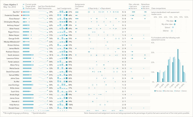
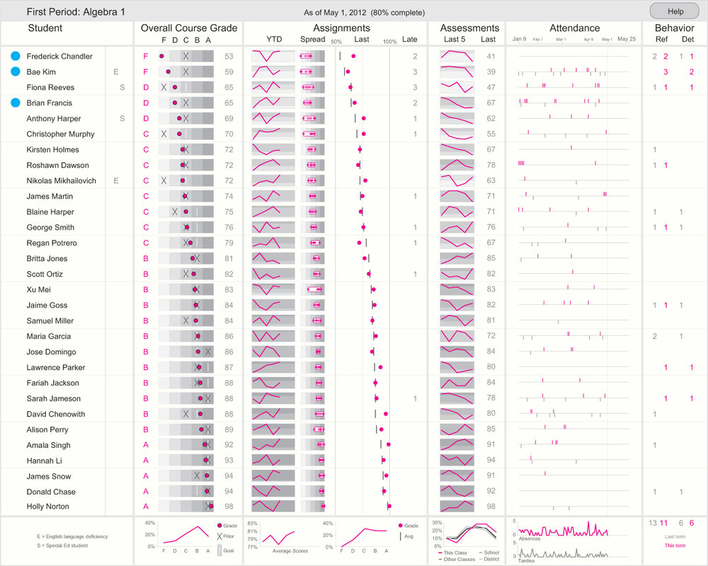
Information Dashboard Content Entries
Photos of winning entries to the dashboard content by Stephen Few.
Notice the light use of color, the white space and the information density.
Related Notes
- Gestalt Visual Principles
- Hacking in Color
- Information Dashboard Design
- Colormaps
- Homelab: Hot Aisle Temp Sensor and Dashboard
- Rainbow Colormaps
- Shape Coding


